Väter in Krisen
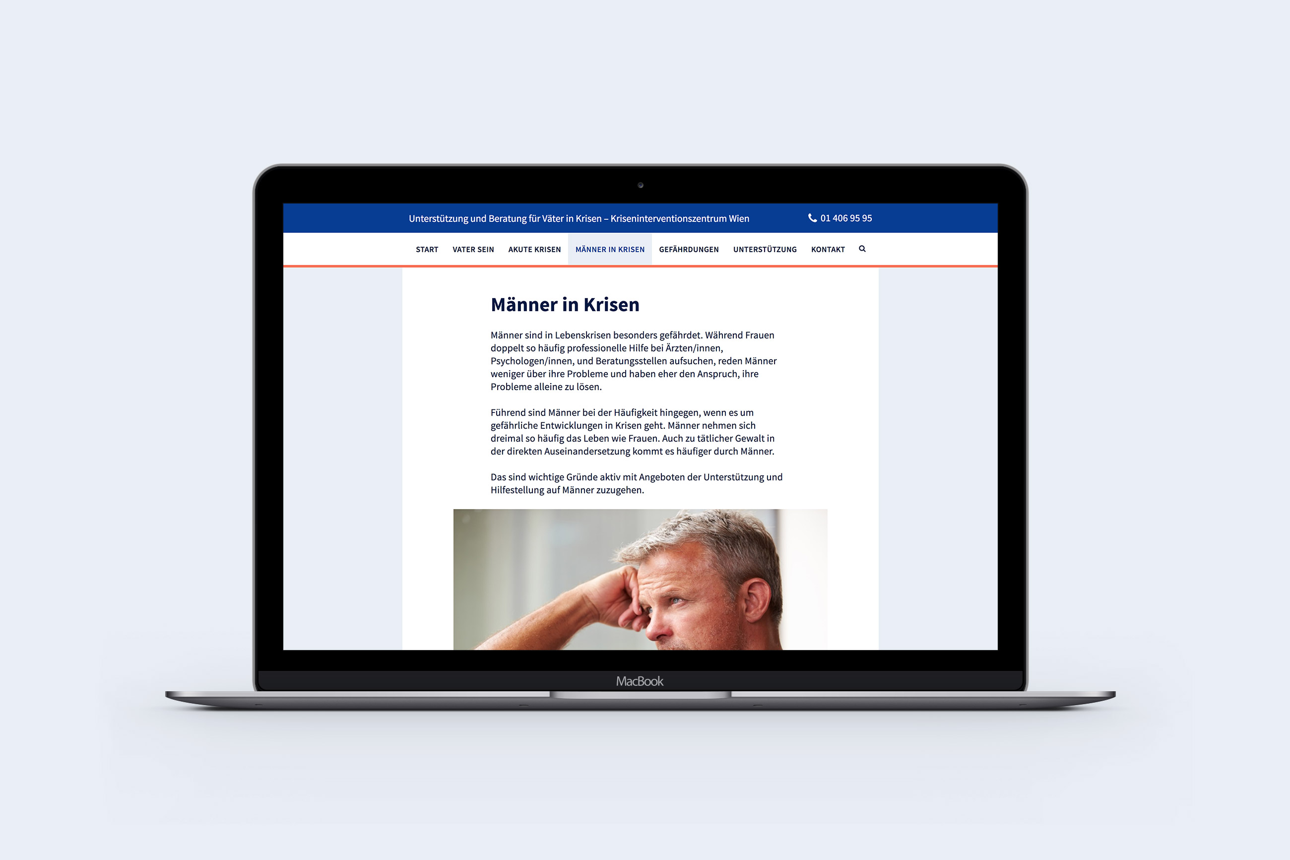
Continuing the collaboration with the crisis intervention center Vienna (have a look at a previous project here), we were asked to create a website for fathers in crises. Designing for a target group I definitely didn’t belong to was going to be challenging, so I started off with some research on design that appeals to a male audience. I then settled for a strong sans serif typeface, a calm blue color scheme with a dash of a dynamic orange and very straight and edgy graphic elements.
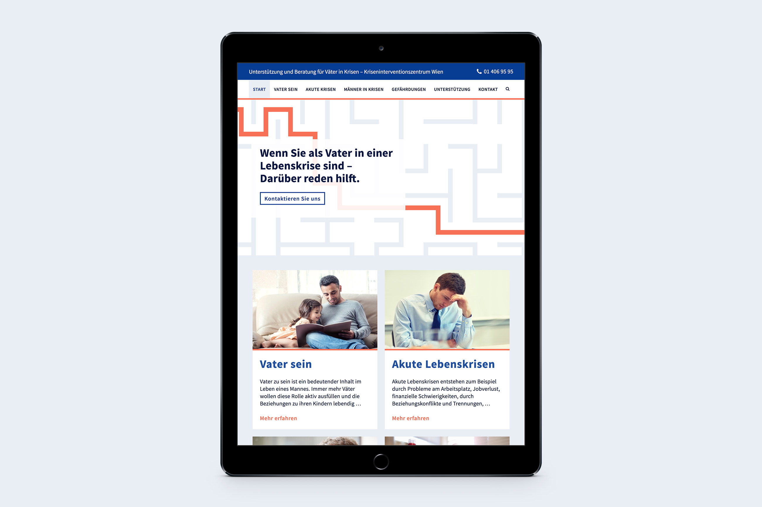
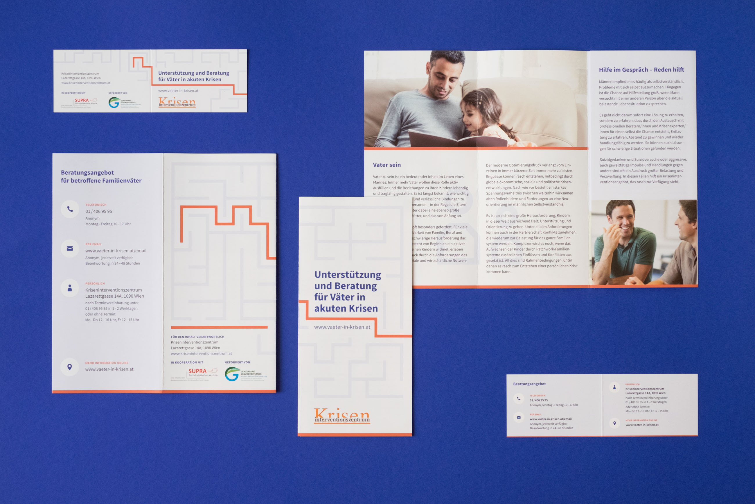
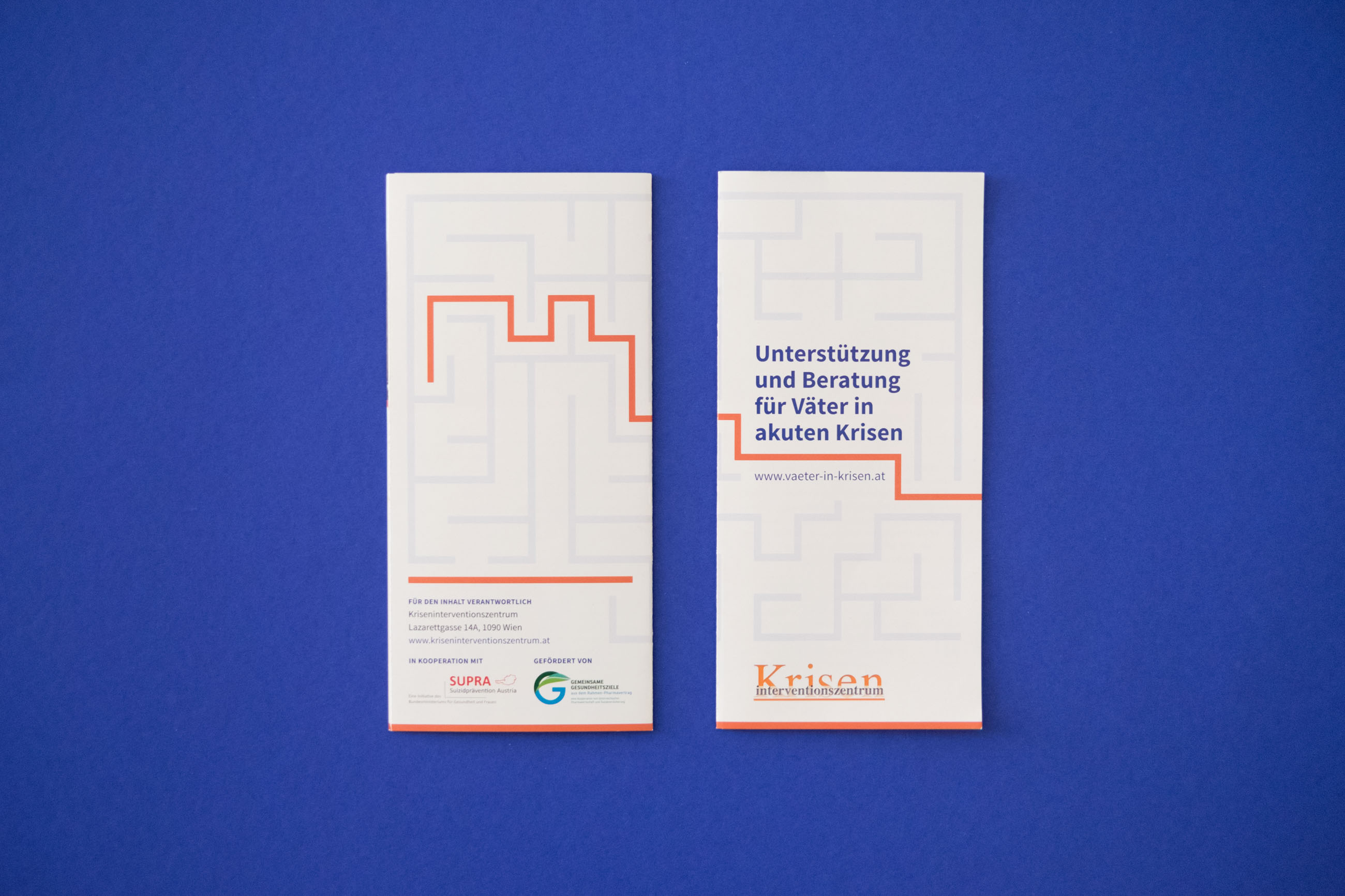
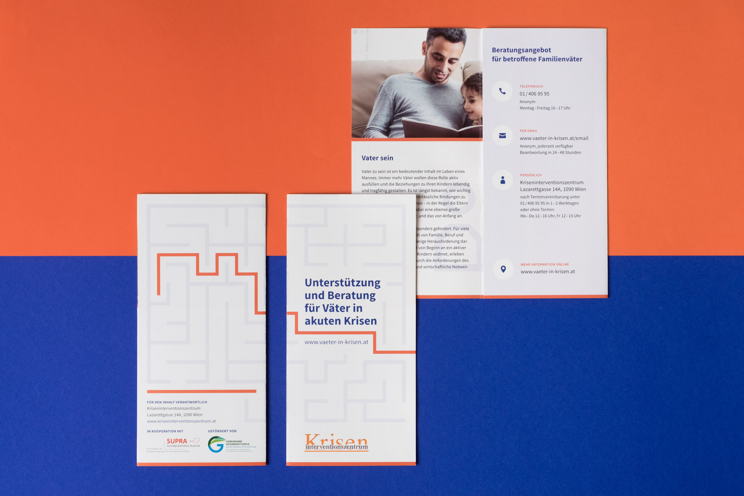
When designing the corresponding folders and business cards, I started using a labyrinth as main visual to illustrate that there are people who can help you master a crisis and get out of a situation in which you can feel lost and helpless. The metaphor worked very well, so I also adjusted the web design to that concept and then passed it on to Daniel, who programmed the website.
This project made me realise once again that solid research and a good concept can go a very long way and are definitely worth investing in. It also opened my eyes to the problems men and especially fathers have to deal with, something I had rarely given a thought to before. So no matter if you also want to end your ignorance on that issue or actually have a problem that you would like to talk about, just head over to www.vaeter-in-krisen.at and have a look around!
- website: www.vaeter-in-krisen.at
- category: web & print design
- team: Daniel Stein
- freelance project, winter 2016/17